Window Display Case Study
This is a Case Study on window displays for stores. I tried to focus on interesting eye catching displays with different materials that would be easy to recreate.
http://vmsd.com/content/holiday-windows-2016-part-i
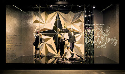
This window display is in Singapore and it is for Christmas time. I think that they did a good job because of the way they used lighting in the display and the way that they used it to reflect off the glittery edges of the folded paper. the clothing is black to make it stand off of the white back ground and contrast merchandise they are trying to sell. This is a fancy store so I'm sure their budget is more than most but recreating this wouldn't be hard. You would just need to cut and fold paper and either glue or spray on glitter to create the shine they achieved. I think that this display is simple but makes a big impact.

http://www.diegopignatta.com/antropologia-del-riuso/
This display is from Anthropologie and it was hard to not choose more from them because all of their window displays are outstanding to me. But this one I think that their choice of both color and material speak out to me. they used hangers which they already have which makes it less expensive and then shaped them into the silhouette of dress and spray painted it. So we can tell that they are balling on a budget.

https://www.instagram.com/p/5D83nJiq6i/
This display is located in London and it is for Dior. I feel as though they were trying to create ornaments and the bags at the top of this ball form are the things that attach to your tree. I think that you could recreate this using pingpong balls and spraying them in order to achieve a pearl like shine. If their concept is Christmas time ornament I think they did a good job. also the deep red back helps make the white balls pop off the back and stand out more.

http://lifeasapepin.blogspot.com/2012/01/coffee-filter-backdrop.html
This is another Anthropologie display this one caught my eye due to the pitch tones of greens and blues. They were creative with their materials and used coffee filters which they then dyed to achieve this coloring. I think that they look like a flower arrangement or those things at carwashes and they could turn on and start to move at any minute. They always uses creative cheap materials and male something interesting and fun each time.

https://www.instagram.com/p/6pEXSkAEgR/
This display for Apple Watch is giving us this effect that the flowers are spilling out of the window and have now entered the peoples space. Think that this is a good design strategy because it is giving the viewer a reason to come in and it is drawing them closer if they see it from far away. Not to mention the bright yellow is eye catching. I feel like their message is if you have this watch you are gonna want to break out and go do adventurous things with the product. this could simply be recreated with paper that is cut out and shaped as well as flat images.

https://www.pinterest.com/pin/341499584229990901/
Talk about a shoestring budget this display used what to be sticky notes as their material. I think that they are probably something more expensive than a sticky note due to the brand. The strongest part is that they recreated the texture in this dress on the back wall and flower. They also positioned the outfit against the white and then added the color element behind so it wouldn't be distracting as the backdrop.It appears that they are coming off the back. The way that they used the color ones to create this flower is a good design choice. I also think that their name is creative for this one since its called "Take Note".

http://www.zimandzou.fr/atlantis
This display is for Hermes in California. The company they hired are known for doing paper sculptures and I think that they blew this one out of the water. The way that they created these different layers and made the front dark and then lighted the main display. This is a very strong display and I would stop if I was walking down the street. Especially to look at the detail that went into it and admire the time it probably took. It would be easy to recreate with paper and cardboard and a laser cutter.
https://www.pinterest.com/pin/172966441913873536/
This display is for Louis Vuitton in Budapest. I find this very interesting because of the use of color and contrast. they used the black background to make the color stand out and the light is focusing on the middle where the product is. They used arrows that are all pointing to the main focus of the product. So if you were to recreate this you could use wood poles and hot glue some pieces of paper. I also think that the use of the yellow on the last circle makes it so that the last thing you see is a happy color and so when you look at the bag you are happy.


Erin---would love to see you post larger images as they will be more impactful.
ReplyDelete